HeartSupport
Rebuilding a national nonprofit's brand, from the feed to the festival field
The results
Community, all platforms: 100K → 650K
YouTube subscribers: 25,000 → 293,000
Channel views: 3.2M → 67.7M
Total views, all platforms: 600M+
Milestone: YouTube Silver Play Button
Creative Director · August 2023 – September 2025
The situation
HeartSupport is a national nonprofit working in mental health and suicide prevention inside the metal music community. Real stories, real stakes, and people willing to say hard things on camera.
The digital presence wasn't carrying any of it. Branding shifted from post to post. Content went out when somebody had time. There was no system underneath it, so every piece of content started from zero, and growth depended entirely on how much any one person could carry that week.
I was hired in August 2023 as a contract video editor.
What the job turned into
The editing scope didn't hold. The organization didn't need someone to cut videos. It needed someone to decide what the videos were for.
Within months, I had creative authority across YouTube, social, and brand, and the contract became a full-time role as growth accelerated. I owned visual identity, messaging and tone, thumbnail and title strategy, and publishing standards. I was also given the task of an organizational rebrand and won board approval for it. That rebrand became the foundation for everything that followed, on screen and off.
The actual work: building an engine
The obvious move with an underperforming channel is to make better videos. Better videos help. They don't compound.
What compounds is a system, so that's what I built:
A content workflow from concept to publication, with defined handoffs between recording, editing, and publishing
Standards for thumbnails, titles, descriptions, and metadata, so quality stopped depending on who happened to be doing the work
A repurposing pipeline that turned every long-form piece into Shorts and Reels, instead of treating each platform as separate work
A single approval path with clear sign-off, tracked in Asana
Taking reaction videos and turning them into a tool for people to open up.
The point of all of it was output that no longer depended on any one person's availability or memory. Scattered effort became a repeatable media engine. The systems outlasted my involvement, which was always the intention.
Furnace Fest
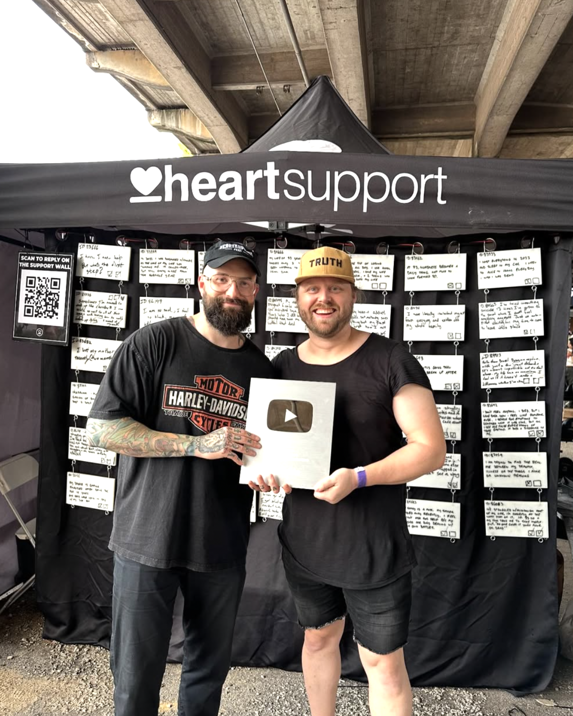
I started making YouTube videos in 2007, hoping to encourage somebody.
Years later, after volunteering, interning, and coming back as Creative Director, I stood at Furnace Fest and opened HeartSupport's YouTube Silver Play Button.
Persistence, mentorship, faith, and a mission worth the work. Meaningful creative work compounds. It just takes longer than anyone wants it to.
Beyond the screen
Not all of it was digital. The rebrand had to hold up in a festival field, on a merch table, and on someone's back walking out of a show, not just in a feed.
One system, every surface
Every physical piece came from the same kit: the HeartSupport wordmark, the heart-and-bar mark, the "Heal the Scene" rallying line, and an eight-color palette of deep reds and near-blacks. Each piece was designed to be recognized from across a venue before anyone could read a word.
The Support Wall
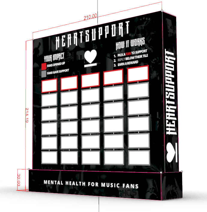
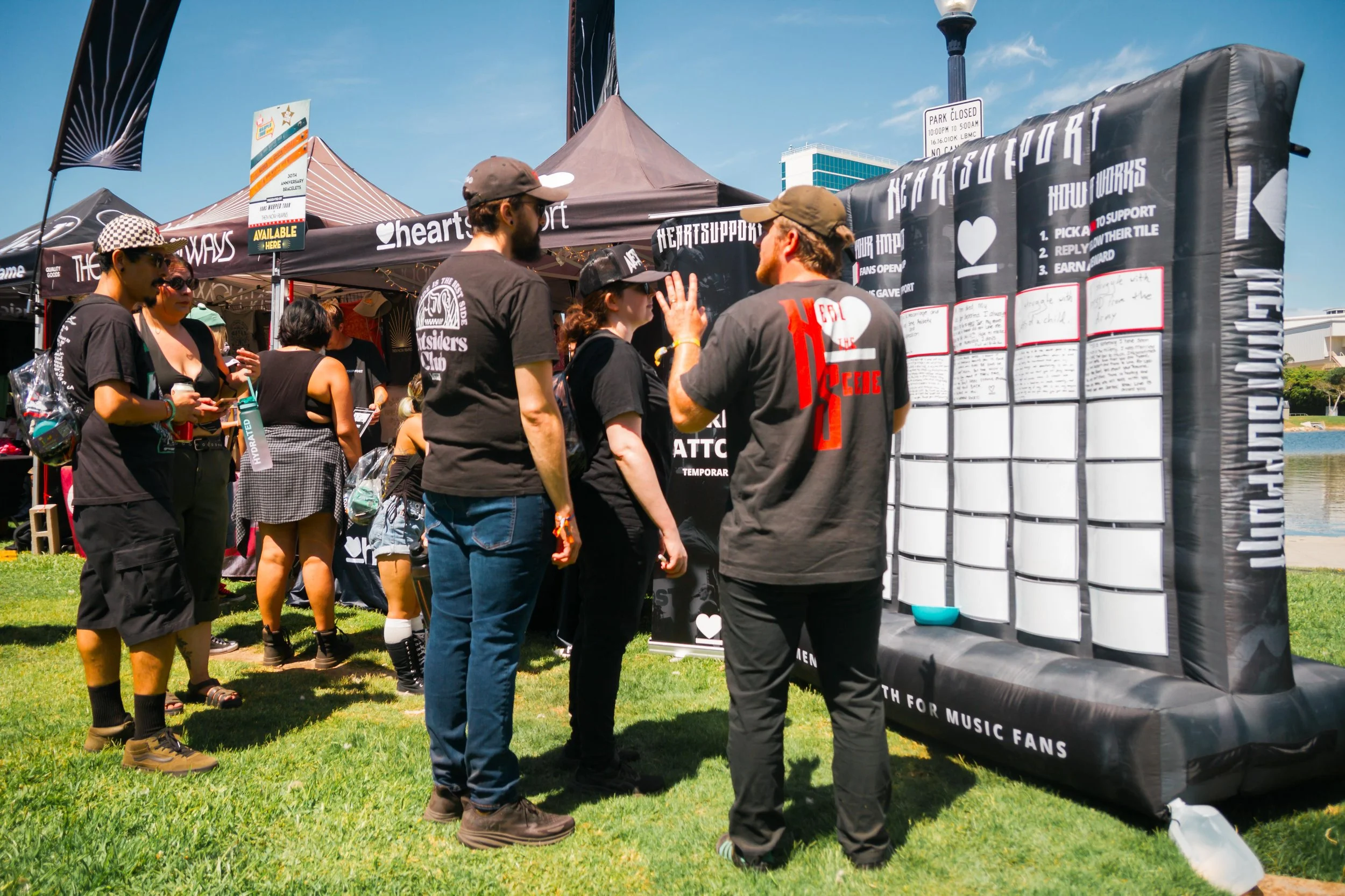
The Support Wall is a concept that has had many forms throughout the years. From a massive 1-ton box to tiles, now to an easy portable blow-up. I developed and designed the Support Wall, a deployable inflatable structure in 7×7 and 10×10 formats, built to travel and set up at events across the country.
It's an interactive exhibit. Fans who open up about what they're carrying leave a note on a red-framed tile. Other fans pick one, write a reply on the tile beneath it. A key on the wall tracks how many fans opened up and how many gave support. The mission, a community taking care of its own, becomes something a stranger can take part in within two minutes.
The event tent
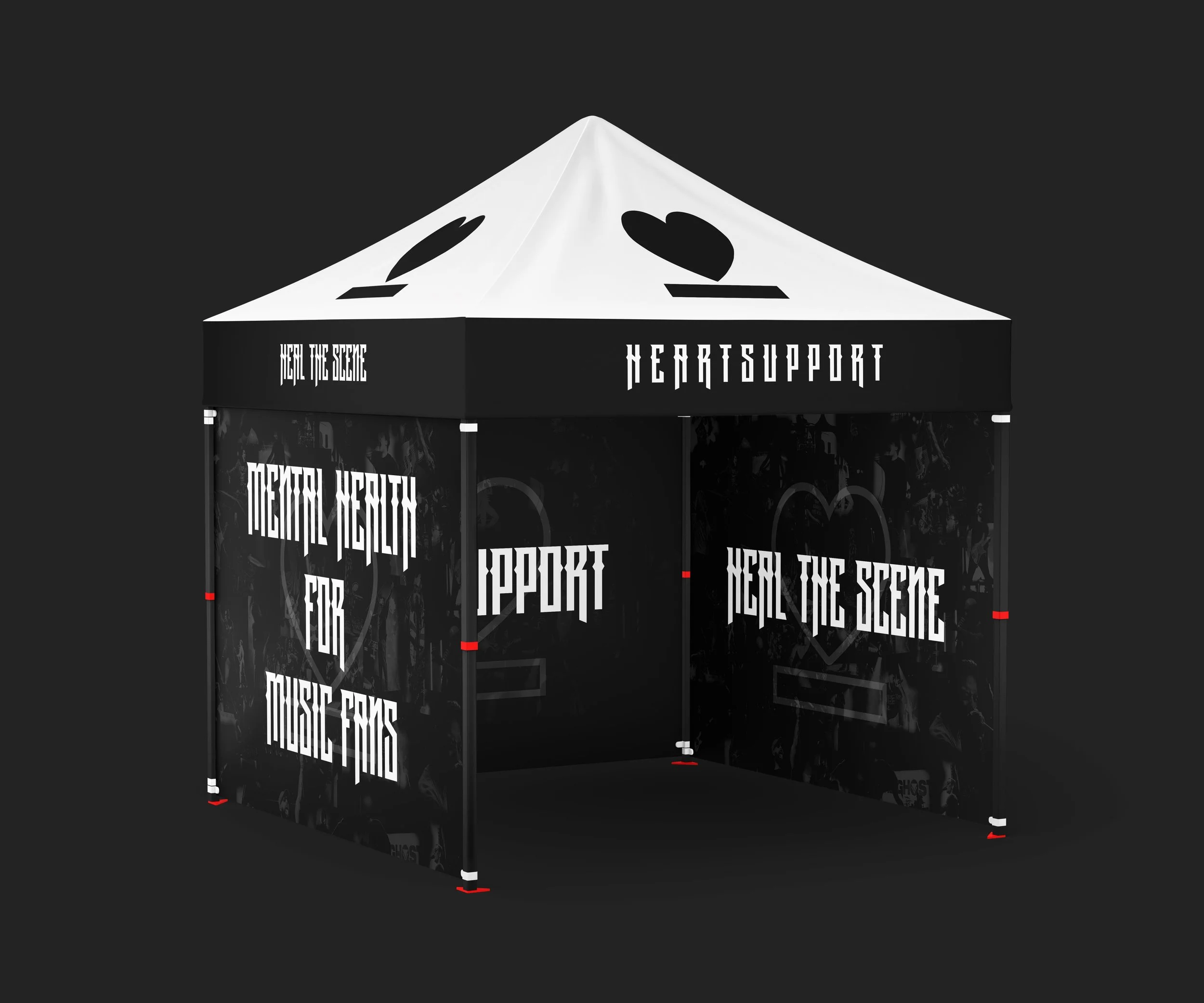
A 10×10 canopy that carries the identity at booth scale. The white peak puts the heart mark above the crowd. The black valance holds the wordmark and "Heal the Scene." The side walls lead with "Mental Health for Music Fans," printed over a collage of live-show photography, so the booth reads as part of the scene rather than a clinic that wandered into it.
Merch
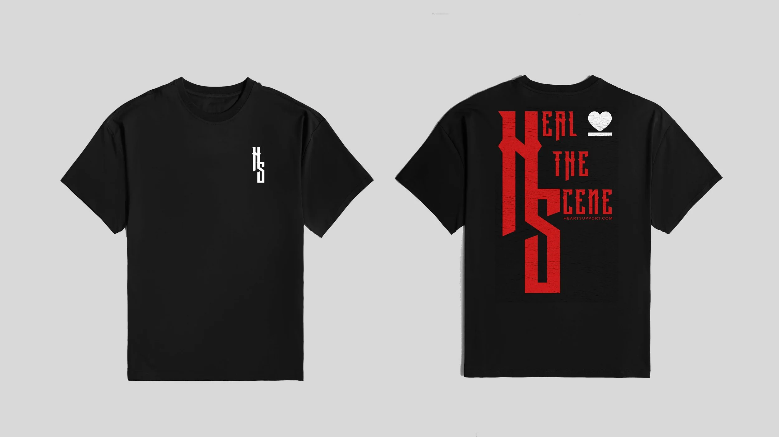
The "Heal the Scene" shirt pairs a small HS monogram on the chest with a full-back print in distressed red. It was designed to be worn like a band shirt, because in this community that's what actually gets worn.
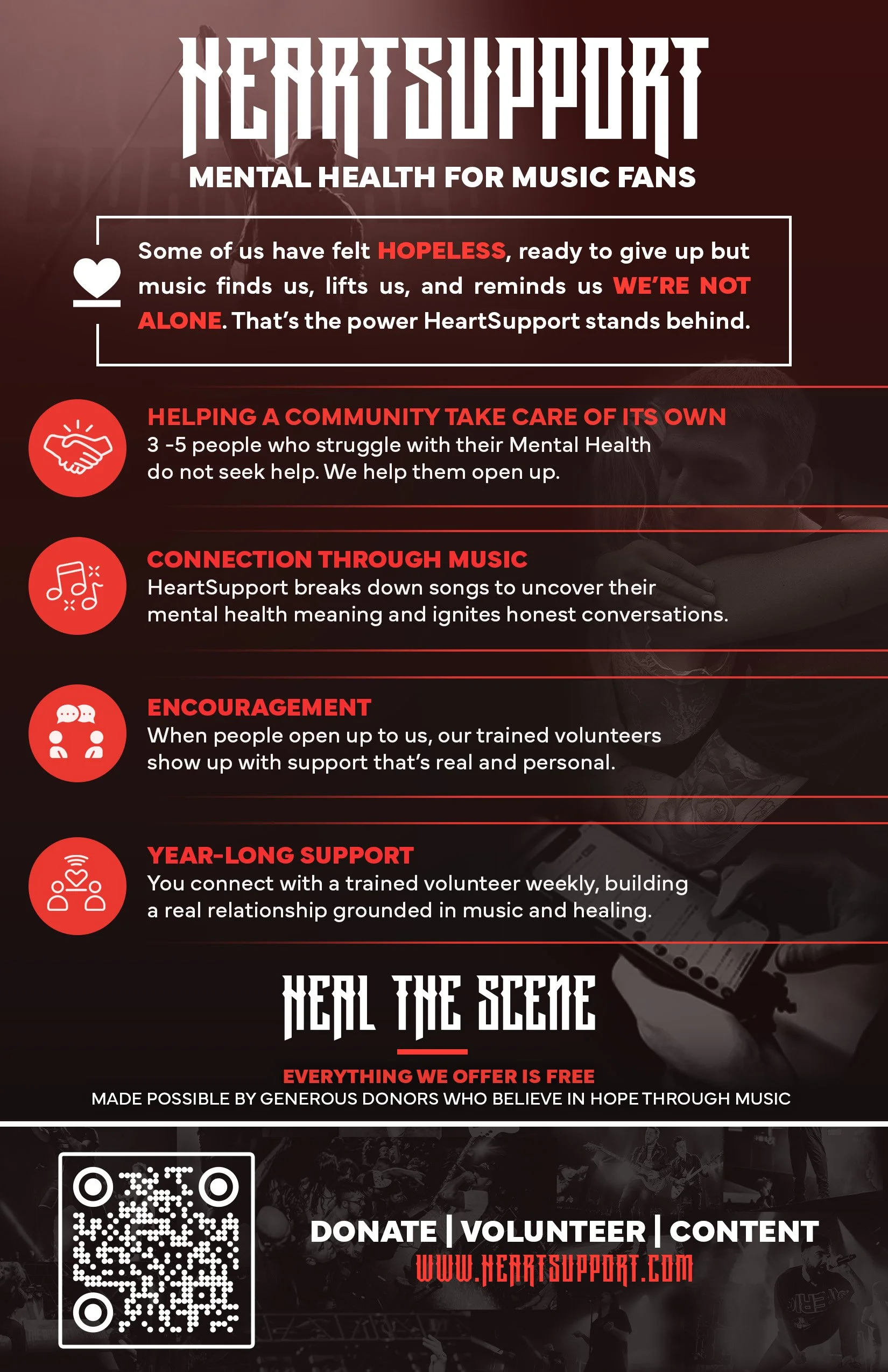
The table one-sheet explains the program in four plain points: a community taking care of its own, connection through music, encouragement from trained volunteers, and year-long support. It ends with a QR code to donate, volunteer, or watch, so a conversation at the booth has somewhere to go afterward.
The physical work is the clearest example of what the brand was actually for. An identity only matters if it gets someone to walk up to the table.
What this means for your organization
The specifics here are a mental health nonprofit and a YouTube channel. The part that transfers isn't either of those.
It's this: most organizations don't have a content problem, they have a system problem. They produce inconsistently because nothing underneath makes consistency possible. Building that foundation (identity, standards, workflow, approvals) is what turns sporadic effort into compounding growth, whether the content ends up in a feed or at a festival booth.
That's the work I do.
Tools: DaVinci Resolve · Adobe Creative Suite · Canon and Blackmagic · TubeBuddy · Google Analytics · Asana
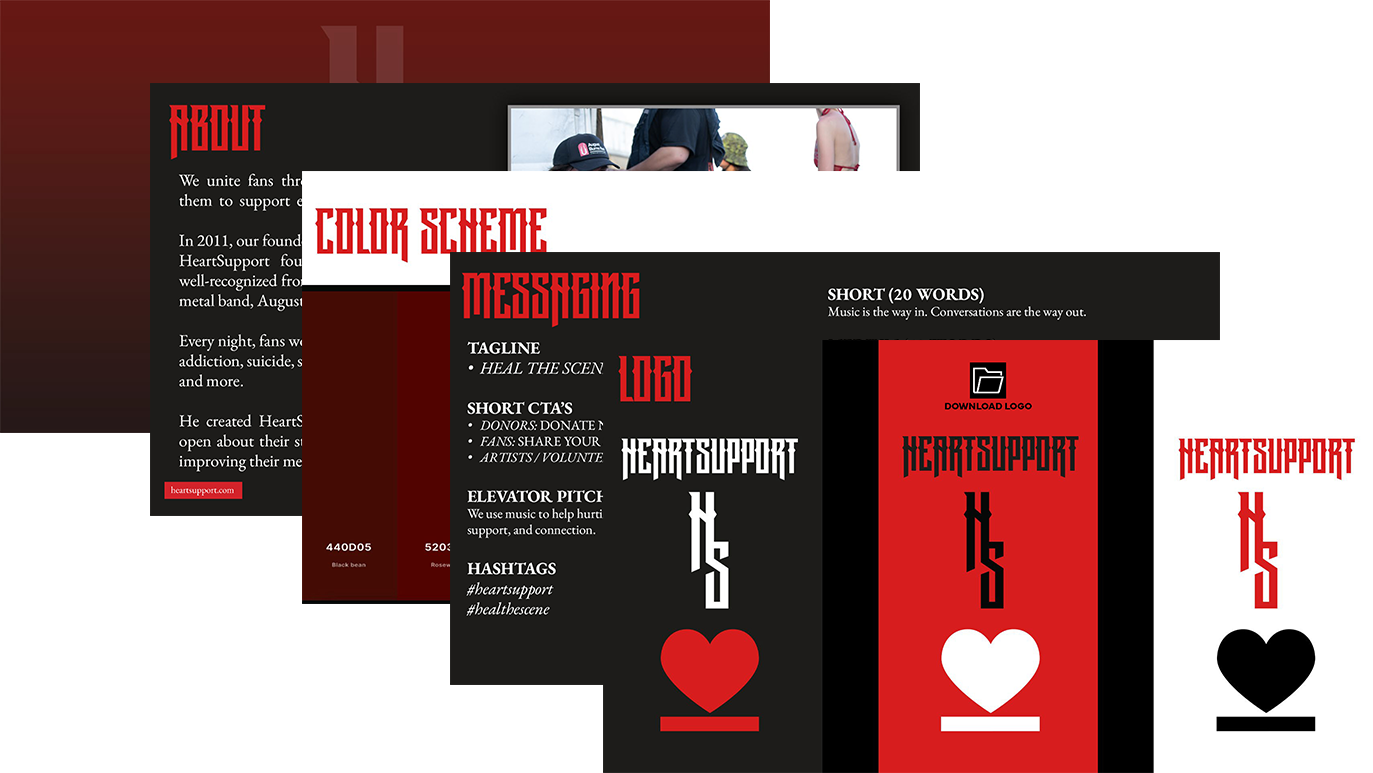
HeartSupport Branding Guide